• Skip to primary navigation
  • Skip to main content
  • Skip to primary sidebar
  • Skip to footer

Picante Publications

Picante Publications

We'll help simplify your magazine design.

  • Home
  • Services
    • Magazine Design
    • Magazine Copyediting
    • Media Kit Design
    • Annual Report Design
    • Catalog Design
    • Our Design Process
  • Get a Quote
  • Publishing Tips
  • Publishing FAQs
  • Call today: 434.466.6969

Picante Publications

How to Choose the Right Paper Stock for Your Magazine

Magazine paper stockIf you’re planning on publishing a print edition of your magazine and haven’t yet gotten around to requesting printing bids, you’ll likely soon find out that printing and mailing/distribution costs can make up a large portion of your operating expenses — so planning ahead and educating yourself on the printing process can make a world of difference both to your budget and in the final quality of the finished product (be sure to check out our blog post on printing tips for magazine publishers). One factor that can have a major impact on your printing costs is the actual paper (often referred to as “paper stock”) on which your magazine will be printed.

But wait … isn’t it the printer rep’s job to find the right paper for your needs? Well, yes and no. Of course, an experienced magazine printer will be able to walk you through your various options — but just as with any major purchase, it’s a really smart idea to be informed on the product you’re buying before you get down to making a final decision. All paper stock is definitely not created equal, so having some background will help you make the right choice.
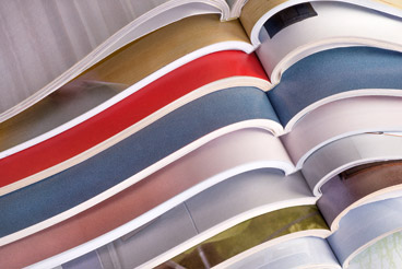
Paper Weight

A number of different factors go into determining the right paper stock for your publication, all of which have to be balanced against budgetary requirements and the preferences of your intended audience. If your audience tends to expect a certain level of quality and exclusivity in the products and services they frequently purchase, consider how paper stock quality will influence the overall presentation of your magazine when it arrives in their hands. For example, for a high-end publication with a more sophisticated look, feel and subject matter, a heavier, higher-quality paper stock might be more appropriate. In contrast, a lighter, thinner stock is usually sufficient for mass-market, general-interest magazines.

Printer reps will often use numerical values (e.g., 40-pound, 60-pound, etc.) to refer to paper weights, and in general a smaller number refers to a lighter, thinner paper stock. You also may hear terms like “text” and “cover” stock, which refers to two separate types of paper (cover stock is often used for magazine covers, while text stock is often used for the interior). I remember when I first started in publishing about 20 years ago, I had a hard time visualizing just what a 60-pound text stock would look and feel like in a printed, finished product, and rightly so. My suggestion is to try not to get too bogged down in the numbers; instead, request paper samples from your printer rep of the specific brand, weight and quality he or she is recommending for your publication. You can even have the printer create an unprinted “dummy” of your magazine in that stock to show you what your publication, with a given page count, will feel like when it comes off press. Holding a dummy in your hands is a much more tangible way to know what you’re paying for ahead of time.

Paper Quality

Much like with paper weight, paper manufacturers use a numerical system to roughly quantify the quality or “grade” of a particular paper stock, typically ranging from #1 to #5, with #1 stocks being the brightest, whitest, finest in texture and highest in quality. Most magazines generally print on stock that ranges from #3 to #5, and again you should keep your audience’s preferences in mind when making a decision on paper grade. Moreover, papers of different grades will often literally feel different to the touch, so this is another good reason to request a dummy from your printer before moving forward.

Paper Finishes

The finish of a paper stock can also have a big effect on a magazine’s perceived quality. Most high-circulation publications are printed on glossy stock, which is usually more affordable than paper with a matte or dull finish. Again, this is where your audience comes into play. Matte and dull finishes can actually have a more sophisticated look and feel, so they might work better for a more upscale magazine audience. On the other hand, a glossy finish can result in more vivid colors in the end product — so it really depends on what elements of your magazine’s design are most important to you. In any case, talk with your printer rep about how the finish might impact the final product before making a final decision.

See for Yourself

If you’re not quite sure what paper to go with, head to your local bookstore or newsstand and peruse the magazines on display there. By flipping through some different titles, you should be able to get a feel for what you like in terms of paper weight, grade and finish. If you’re unsure about exactly how to communicate the appropriate terminology for estimating purposes, you could even buy a copy of a magazine you’d like to mimic, mail it to your printer rep and have them match it as closely as possible to a comparable stock for your publication.

Mailing & Shipping

Another factor to consider in choosing paper stock is the cost associated with mailing and shipping the magazines. A heavier stock quite literally will weigh more, potentially contributing to additional postage and delivery costs. For the sake of convenience, we generally recommend working with printers who also provide mailhouse services, but in any case, be sure to ask your printer rep about the potential impacts of paper stock on your delivery budget before settling on your choice for the paper stock.

Be Your Own Advocate!

For many new publishers, choosing paper stock is filled with unknowns — unknowns that can dramatically impact your bottom line and contribute to, or detract from, the success of your magazine. So don’t be afraid to ask lots of questions, even if they sound like “dumb” ones. Use your printer rep as a valuable source of expert information, and be sure to talk with multiple vendors to negotiate the best possible price for your magazine printing needs.

Magazine Design and the Beauty of White Space

So you’re a magazine editor/publisher, and it’s time to map out your next issue: what order the departments and features will go in, where the ads will fall (if you’re an ad-supported magazine), how much photography you’ll need to come up with, etc.

Oh, and one other big, important factor: word counts.

Whether you’re writing all your content yourself (not unheard of for smaller magazines) or delegating the editorial to a team of staff or freelance writers, figuring out just how much needs to be written can be complicated. The answer probably depends somewhat on the design sensibilities of your particular magazine’s readers, and in reality there is no “right” answer — setting your word counts is more about establishing a balance point between the editorial copy and the overall design and layout of each individual story.

So, then, where should that balance point lie? Again, not a simple question. But as the managing editor, you should resolve to address that question purposefully and proactively (rather than as an afterthought) by answering another key question: How do you want your readers to experience your publication’s content?

More Than Words

For many magazines, the editorial content comes first in the minds of readers. Particularly for news-heavy, informative periodicals, readers pick up a copy expecting editorial substance and (perhaps) a good deal of intelligent commentary. For other publications, readers may value the visuals, photography and overall design feel just as much, if not more than, the editorial content.

I would argue that unless there’s a really, really good reason why a magazine’s look should be text-heavy, dry and straightforward, the design should always be a major consideration in the planning of an issue. Magazines aren’t paperback novels or heavy nonfiction texts — they’re meant to be an experience and a feast for the senses. Done properly, the design of a magazine article (particularly feature articles) should be integral to the reader’s absorption of the story, making the editorial more enjoyable and, in fact, more readable! An experienced magazine designer will have a whole library of techniques for enhancing the content, creating a visual hierarchy in the layouts, and keeping readers engaged with an issue from cover to cover.

Room to Breathe

To a designer, a magazine layout is somewhat like a puzzle: There are a certain number of pieces, and everything has to fit together within a finite space to create a cohesive, attractive overall picture. Text, drop caps, photos, infographics, pull-quotes, sidebars and any other appropriate design elements all need space to thrive — not merely to fit — within a design. Try to pack too much in, and you’re probably going to end up with a cluttered, cramped design that won’t be very pleasing to the eye or enticing to interested readers.

And let’s not forget that all-important mystery design element: white space (also known in the design industry as “negative space”). White space is just that: empty space within a design that, at first glance, doesn’t really seem to have a purpose, but actually provides much-needed separation and cleanliness within a layout. More broadly, white space can also be thought of as space without text — perhaps instead occupied by images and other visual content that help to break up the “grayness” of a large block of editorial copy.

With so many elements competing for positioning, it might seem counterintuitive (and even wasteful) to throw empty space into the mix, but thoughtful use of white space can make all the difference between a mess and a masterpiece. Empty space also helps to establish a visual hierarchy in a design, silently telling the eye where to focus attention first, which in turn will make reading a much more enjoyable experience.

If you’re not sure whether your existing layouts make intelligent use of hierarchies, open up an issue and ask yourself what your eye is naturally attracted to first, second and so on. If you can’t answer that question quickly, or your eye is jumping from place to place, you probably have a design issue that needs correcting — and white space is just one technique to help get you there.

Making Peace With White Space

What does all this have to do with planning the next issue of your magazine? Well, it’s often at the very beginning of the planning process that word and page counts are set for an issue, which in effect determines the amount of space your magazine designer will have to work with. The more space you allow for the designer to do what he or she does best, the more interesting and innovative the design is likely to be — and the more pleasant an experience your readers are likely to have.

But if you’re an editor who loves a thorough, well-written piece, the whole idea of leaving extra space in a layout — space that could be filled with more words — might not make much sense. The idea behind white space, however, isn’t to take away from your content. Quite to the contrary, white space and other important design elements should work together to create a synergy with the editorial that enables your stories to come alive and hit home with readers. If you’re trying to cram every nook and cranny in the design with something, you may need to step back and evaluate whether all that content really is adding to or detracting from the reading experience.

Now you might be asking: Where is this extra room for a more engaging design supposed to come from?

For starters, try lowering your word counts a bit — perhaps by 5-10 percent (or more, if you can). Your magazine designer will sincerely thank you for the extra room, and your layouts should, under the right art direction, evolve to become richer and more interesting.

If your page count is flexible, you might try adding a page here or there (of course, keeping the total page count divisible by four for print magazines) to provide some extra room to work with. Or if your page count is fixed, another option might be holding out a story (perhaps for web-only publication, to help drive readers to your site), thereby allowing other articles some additional space to breathe.

Again, opening up your layouts is about striking the proper balance for your readership. While the text is central to a magazine’s content, it isn’t everything, and you should carefully consider both editorial and design space needs while setting word and page counts.

Case Study: Energy of the City Magazine

A lifestyle magazine published by a major Washington, DC-area utility company, Energy of the City has been a wonderful publication to design. From the project’s outset in 2008, the client expressed a strong desire to make the magazine a gorgeous, almost lavish reading experience for its audience. To accentuate the carefully crafted editorial content, striking photography, innovative typography and liberal splashes of color — along with plenty of editorial-free space — drive the magazine’s design. Energy of the City is a perfect example of “less is more,” with visuals providing a graphic framework to allow the editorial content to unfold without dominating the layouts. The design elements are an integral part of the overall “story” the magazine seeks to tell, and the working together of editorial and visuals make this an experience that is to be enjoyed and absorbed slowly, rather than flipped through hastily.

To be sure, this kind of design probably isn’t appropriate for all publications, but the use of space and other graphic elements is perfect for a magazine aiming to immerse its readers in a feast for the senses.

Magazine Publishing for Nonprofit Organizations: Engagement is Everything

When you think ‘magazine,’ you might first picture of one the countless newsstand titles making use of provocative headlines and tantalizing photography to compete for reader attention on newsstands all across the globe. Or perhaps you might think of one of the myriad niche publications targeted toward consumers interested in a given subject matter. What might not immediately come to mind, however, is a magazine conceived to support the aims and objectives of a nonprofit organization.

Much like mass-market and niche consumer-oriented publishers, nonprofits have relevant messages to communicate and an audience that is actively interested in what that organization has to say — an audience that is, in effect, just another niche market, and one that must be engaged continually. Just as a newsstand magazine has to continually create compelling content to keep its readers coming back, issue after issue — for the publication’s very survival, in fact — nonprofit groups also rely on sustained engagement (as well as donations) from their supporters to thrive over the long term. Such support is, of course, commonly sought through periodic fundraising efforts via direct mail marketing pieces, with response rates often in the single digits.

While such donation solicitations may form the backbone of many nonprofits’ fundraising efforts, are they enough to meet your organization’s financial needs, and could there be a better vehicle for moving your supporters to give? Many nonprofits are now turning to publishing a regular magazine — thoughtfully written and professionally designed — to help them connect and stay engaged with stakeholders.

Why a Magazine Over a More Traditional Direct Mail Piece?

The advantages of publishing a nonprofit magazine, perhaps monthly, bimonthly or quarterly, are many — be sure to read through a great article written by Lindsay Oberst of Socialbrite that covers this very topic, but here’s a quick summary of her take on the benefits:

1. To attract new members/donors and keep current ones.

2. To boost donations.

3. To build a community around your organization’s objectives.

4. To educate and inform your audience on the projects your group is undertaking.

5. To communicate with stakeholders who may not be online.

6. To encourage your readers to take action to support your cause.

All of these benefits essentially have to do with a common theme: establishing, fostering and strengthening connections with your supporters. Such connections are vital to ensuring that your audience stays interested and invested — both in terms of moral and financial support — and a magazine format can prove far more effective than other types of marketing efforts in terms of reader engagement.

To be sure, direct mail appeals are an important mainstay of nonprofit marketing campaigns, and producing a magazine should ideally add to your overall campaign, rather than replace your existing one. So what’s so special about publishing a magazine? In addition to the benefits listed above, I would append the following:

1. Magazines give you an opportunity to get much more in depth with the messages you convey to readers. A direct mail piece can go into some detail, but not many recipients will likely want to read a multi-page letter/brochure that is strictly an appeal for support. With well-planned and well-written magazine editorial content, you can use feature stories and department articles to go beyond mere appeal-oriented marketing messages and instead focus on the stories behind the people your organization serves, as well as how donations from supporters impact beneficiaries in the real world. This “show, don’t tell” approach can have a much more emotional and meaningful impact with potential donors than can a more straightforward appeal. What’s more, the ability to use plentiful high-quality photography will help you put faces to these stories, reinforcing the power of your content even further.

2. Should you choose to print your magazine, a well-designed, high-quality publication is more likely to remain in front of potential donors for a longer period of time — increasing the chance that your audience will take the time to examine its content. Unlike a typical direct mail piece, a magazine should offer editorial value and insight for readers — again boosting its shelf life and making your messages less likely to go straight from the mailbox to the trash bin. In fact, if the magazine’s design and editorial are both produced with world-class quality, supporters will look forward to the arrival of each new issue and incorporate reading the publication into their regular routines.

3. One nice benefit of the longer magazine format is that it allows you space to be able to print lists of donor names more frequently, as desired. Many organizations reserve donor lists for their annual reports, but including these lists on a more frequent basis can provide more timely gratification for those who decide to donate to your organization. (Incidentally, a magazine’s length can vary widely in terms of page count, so long as, for print editions, the page count is evenly divisible by four.)

4. In addition to its messaging benefits, the magazine format also provides you with yet another direct marketing piece, as direct-response materials — including house ads, business reply cards (BRCs), business reply envelopes (BREs) and more — can be bound or tipped (glued) right into the magazine itself, and perforated for easy detachment. Including these materials can help tie your magazine content with a call-to-action for supporters, without coming across as an outright appeal for donations.

Print, Digital or Both?

Print magazines are, as mentioned above, a great way to get your messages in front of your nonprofit’s key constituencies. For larger runs in the thousands, offset printing is probably the most practical option, but digital printing can be a cost-effective alternative for smaller runs (see our blog post “How to Get Printing Bids for Your Magazine Design Project” for a much more in-depth discussion on printing options).

In this highly digitized age, however, distributing your magazine in as many formats as reasonably possible is key to getting your messages out there. Creating desktop/laptop-, tablet- and smartphone-friendly digital magazine editions is fairly straightforward these days. Not everyone likes to read long-form content online, however, so offering a print edition is a good idea — particularly for older audiences.

How to Get Started

While originally intended for nonprofit hospitals, our blog post “Magazine Design and Publishing for Hospitals: How to Get Started” is a good place to learn more about the nonprofit magazine publishing process in general. One word of caution, however: Should you decide to go forward with publishing a magazine, remember that a high degree of quality — both visual and editorial — is key to establishing and maintaining credibility with your supporters. Magazine design is very much a specialized skill within the graphic design industry, so be sure your magazine designer has the experience to create a product that is both superior and appropriate for your niche audience.

Case study: OUTREACH Magazine

To communicate with its various stakeholders as part of its efforts to end extreme poverty worldwide, the stories Outreach International publishes in OUTREACH Magazine focus primarily on the people the organization serves. In keeping with the humble surroundings of its beneficiaries, the magazine’s overall design has a down-to-earth, natural feel that tends toward muted tones, while making use of striking photography to help tell the stories of communities around the globe and connect with the organization’s supporters. In doing so, the magazine adds tangibility to the faces and narratives of remote peoples — establishing a genuine, heartfelt connection and engaging readers on an emotional level that would otherwise be difficult. The magazine goes far beyond a typical marketing/appeal piece in its ability to inspire empathy and spark action, helping donors and other stakeholders realize the true value of their investment in the organization.

Case study: Sentara Martha Jefferson Magazine

Martha Jefferson Hospital makes effective use of its thrice-yearly flagship magazine to communicate with a diverse array of audiences, including donors, local community members and potential patients, to keep readers apprised on new services and technological advances available at the hospital, as well as featuring public outreach initiatives and human interest stories. To promote general awareness and help inform community members who may be facing medical challenges, editorial content often focuses on accounts from patients who have received care at the hospital, and how they faced their own challenges. In today’s changing and highly competitive healthcare environment, the magazine helps Martha Jefferson reinforce its identity as a leading healthcare provider and public service organization, serving as a key element in the hospital’s overall outreach and marketing campaigns. In addition, the Martha Jefferson Hospital Foundation dedicates a portion of each issue to profiles of donors and how their contributions impact real-life hospital patients and staff, as well as more detailed information on the hospital’s philanthropic objectives and initiatives. Donor-focused content enables the hospital to show donors — large and small — how their support is put to use for the benefit of the entire community.

Magazine Publishing Tip: The Prototype Issue ‘Soft Launch’

Magazine prototype issueSo you have a great idea for a new magazine. You have some or all of the editorial copy ready to go for the first issue, but you don’t have enough advertisers signed on to support publication costs. And, of course, you don’t have the circulation numbers to help you market to prospective advertisers. In short, you’ve found yourself in a common conundrum faced by many new magazine publishers.

So what to do?

First, if you haven’t yet developed a media kit for your magazine, this needs to be top priority. Media kits are an invaluable tool for communicating your vision for your magazine — as well as a host of important demographic/target market information — to prospects, and having success with advertising sales will likely be difficult without a focused, well-designed presentation. Be sure to read through our blog post “Top 10 Media Kit Tips for Magazine Publishers” for valuable tips and ideas on how to go about crafting your kit.

Next, consider doing a “soft launch” of your magazine by producing an abbreviated prototype issue to distribute to advertisers, which can be a great way to show off your publication and add an important sense of tangibility and solidity to your venture. The prototype issue could contain as few as 8 pages, but going with 12-20 pages will probably make a more solid impression on your sales targets. Content should be representative of what your typical articles will be going forward, but for this initial issue, be sure to select particularly interesting and relevant stories; you’re trying to make a quick but meaningful impression here, so go with stories that will be more likely to wow readers — and, by extension, advertisers). Also, be sure your content has been carefully edited and proofread by a professional copyeditor; nothing will turn off a prospect as quickly as a sloppy, unprofessional publication that isn’t truly ready for public consumption. If you want to be viewed as a serious magazine publisher worthy of your prospects’ advertising dollars, your editorial needs to be artfully written and, of course, free of typos and grammatical errors.

The design of your prototype issue is also extremely important to the depth and quality of the impression you leave with prospects — this is your first chance to persuade advertisers to believe in your publication and invest their limited marketing budgets with your venture, so you should be aiming for a world-class look and feel from the very start (you can read more about the importance of establishing a top-notch magazine design in our blog post “Magazine Design Quality: Where It All Starts”). You’ll have a very short window in which to catch and hold the attention of prospects, and the design is most likely the first aspect of your magazine they’ll focus on, before they dive into any of the articles — so make sure your first impression is a compelling one. An experienced, savvy magazine designer will be experienced in developing designs that are appropriate for your niche target audience, and like the editorial copy, the design should be as engaging and skillfully executed as possible.

Since the prototype issue will be distributed to a limited number of recipients, you should probably consider printing a small run using a digital printing provider (as opposed to an offset printing provider, which is really only cost-effective for large runs). Digital printing will allow you to produce smaller quantities at more affordable costs — and you can always print more copies as you expand your sales efforts. While you can still (and probably should) make the issue available online as a PDF or digital flipbook, giving out printed hard copies will allow you to mail or hand the issue directly to prospects, helping to ensure that your magazine gets in front of the right decision-makers.

Beyond providing you with a powerful marketing tool, producing a prototype issue also gives you the benefit of doing a small-scale dry run, allowing you to work any kinks out of the editorial, design, production and printing processes, as well as increasing your familiarity and confidence with running a magazine enterprise. So by the time you begin your first full-scale issue, you’ll have a better handle on any aspects of the magazine publishing business that may have been unfamiliar to you previously. Moreover, since the prototype issue is only distributed to prospects (and, conceivably, potential investors), you might be able to use much of the content from the prototype as part of your first full issue — provided that the content is still timely and relevant.

Glossary of Magazine Design Jargon, Terms and Definitions for New Publishers

Speech bubble with question markHere at Picante, we work on designing and producing magazine issues just about every single day. It occurred to me recently that, as part of our workflow, we rely on a lot of graphic design terminology that might come across as confusing jargon to new publishers — so I decided to put together a glossary of terms and definitions that hopefully will prevent some of that confusion (this isn’t a complete list, but it should serve as a good starting point):

Adobe Illustrator: The software many designers use to create and modify vector images.

Adobe InDesign: The software many magazine designers use to lay out an issue.

Adobe Photoshop: The software most designers use to manipulate and enhance bitmap images.

Bitmap images: Images, such as digital photographs, composed of individual pixels (points of color).

Bleeds: When a magazine or other printed piece goes on press, the printer actually prints on a larger area than the final intended size of the finished magazine (also known as the trim size). The extra inked paper that will be trimmed off as part of the finishing process is known as the bleeds, which typically range in width from 1/8″ (0.125″) to 1/4″ (0.25″). Bleeds are needed due to the fact that the trimming process isn’t always perfect, and running content beyond the trim line helps to ensure that unsightly white gaps won’t appear in the final product. So, for instance, if a photo or other design element is intended to run to the edge of the magazine, the designer will actually run that element beyond the trim line. That element then “bleeds.” Documents that bleed along all outside edges are said to have “full bleeds.”

Callout: A design element, usually smaller than a sidebar, used to highlight a specific piece of information not contained within the main body of an article. Can include text and/or graphics.

CMYK: Shorthand for “cyan, magenta, yellow and black,” CMYK stands for the four ink colors utilized in a typical four-color/full-color print run. During the printing process, tiny dots of these four colors are combined in myriad combinations to produce a wide range of colors visible to the naked eye.

Cutline: Another term for a caption used to describe or annotate photographs and illustrations in a magazine.

Department: An article category that regularly appears in a magazine, departments often have a more consistent look from issue to issue.

Digital edition: An online version of a magazine issue, coded in web pages, that is intended to be viewer-friendly on — and respond dynamically to accommodate — a wide range of devices (e.g., desktops/laptops, tablets and smartphones). Click here for more information on responsive magazine digital editions.

Dropcap: Sometimes included in the opening paragraph of a magazine article, a dropcap is a relatively large, one-letter design element (usually a capital letter, and usually the first letter of the opening word of the paragraph) that “drops” down alongside several lines of copy in that paragraph. Used for aesthetic appeal and to draw the reader’s eye.

Editorial: All non-advertising content in a magazine issue.

Eyebrow: A text/design element often used at the tops of article pages — particularly department pages — to indicate the magazine section to which an article belongs.

Feature: The “showpiece” articles within a magazine issue, features typically are unique and more involved/elaborate in terms of design. The cover story is usually considered to be one of the feature articles, but an issue may contain several other features as well.

Flipbook: Another option for distributing online versions of a magazine issue, flipbooks are usually Flash-based replicas that aim to simulate the look and feel of “flipping” pages in digital format. Flipbooks can also contain multimedia and other features not available in print editions. Click here for more information on flipbook editions.

Folio: The information at the bottom of most non-advertising magazine pages, often including the page number, magazine title and issue name.

Fractional ads: A generic name for ads smaller than 1/2-page (e.g., 1/3, 1/4, etc.).

Gutter: The center channel of a printed, bound magazine.

Kerning: A design-specific term for the spacing between letters. Kerning can be adjusted narrower or looser, depending on space needs and limitations.

Layouts: Another term for magazine article designs.

Leading: The spacing between lines of text — can be adjusted as needed.

Masthead: A small section of the magazine, usually located near the front, containing a list of magazine staff and contributors, issue volume/number information, copyright information, ISBN information, legal notices, etc.

Nameplate: Another term for the magazine logo that appears on the cover and elsewhere.

Output specs: When an issue is ready to send to the printer (and/or digital edition/flipbook provider), your magazine designer will need a list of specifications to use when outputting the final PDFs. These specs can include image resolution, bleed size and a number of other criteria.

Paper stock: The physical paper on which a magazine is printed.

Perfect binding: A binding process in which the gutter edges of the interior of the magazine are ground down a bit, coated with adhesive, and bound to the sheet containing the covers and spine. Perfect binding usually isn’t a practical option for smaller page counts, but your printer can advise you on specifics as to the best fit for your needs.

Prepress: A general term for the multistep quality-control check performed by your magazine designer prior to outputting the final proof. Prepress helps to ensure that a magazine is as perfect as possible before it goes to print and/or digital output.

Press-ready files: This one is fairly self-explanatory. Refers to files (usually PDFs) that are ready to be sent to the printer to produce the final product.

Pull-quote: A design element that “pulls” a snippet from an article’s content. Often used to highlight important points and enhance the overall design.

Resolution: Refers to the amount of information/detail contained in a bitmap (pixel-based) photograph or illustration. Printers typically recommend a resolution of at least 300dpi (dots per inch), also known as “high-resolution” or “high-res.” Images with lower resolutions may appear pixelated in print, varying in proportion with each image’s respective dpi. Medium-res images (approx. 150dpi) are often suitable for online flipbooks and digital editions, and low-res images (72dpi) are standard on websites. Your magazine designer can output PDFs at varying resolutions, according to specific needs, but it’s always best to start by taking/purchasing hi-res images, as it’s not possible to increase a bitmap image’s resolution without sacrificing a proportional degree of quality.

Saddle-stitching: In saddle-stitch binding, the magazine is laid flat, then stapled from the outside (cover) toward the inside (centerfold), then folded to the final size — this type of binding has an upper page limit, depending on the thickness of the paper stock, so your printer will be able to advise you on whether or not saddle-stitching is appropriate for your project.

Sidebar: A type of mini-story or aside used within a larger article. Usually includes content related to, but not part of, the main article.

Silhouetting: A production process carried out using Adobe Photoshop, usually to remove/isolate a photo subject from its background or surroundings.

Spine: For perfect-bound magazines, the spine is the strip of cover between the front and back covers. Often contains the magazine title, issue volume/number, etc.

Spot/Pantone/PMS colors: In some cases, you may have a very specific color (for example, a corporate color that must be accurate for branding purposes) that will need to be included as a separate step from the CMYK printing process. These colors, widely known as “spot colors,” “Pantone colors” (for the company that produces them) and “PMS colors,” are available in thousands of hues.

Spreads: A spread is a composite of two pages that appear next to one another in a magazine issue. Viewing layouts in spreads (as opposed to single pages) often makes the design easier to visualize as a whole.

Stock images: Photography and illustrations that can be purchased/licensed through various websites. Stock can be very helpful in cases where hiring a photographer for a custom photo shoot is impractical/unaffordable.

TOC: Shorthand for the table of contents.

Trim size: The final, trimmed size of a printed magazine.

Typography: Refers to the use of various fonts/typefaces. Typography can in itself serve as a significant part of a magazine’s design, and should not be overlooked.

Vector images: In contrast with bitmap images, vector images use mathematics to delineate their shapes. Illustrations and icons often use the vector format. And unlike bitmap images, vectors can be scaled up infinitely without a loss of resolution/quality.

White space: Also known in the magazine design industry as “negative space,” white space is the empty space within a design that provides much-needed separation and cleanliness within a layout, preventing a cramped, cluttered feel.

How to Create the Right Magazine Design for Your Niche Audience

As a whole, the magazine publishing industry covers just about every kind of topic conceivable. Literally. If you can think it up, there’s probably a niche magazine that specializes in it. Among such eccentric titles are Practical Sheep, Goats and Alpacas, Portable Restroom Operator, Miniature Donkey Talk and yes, the unforgettable Girls and Corpses (I kid you not — and this is just a small sampling).

But hey, who am I to judge? The beauty of niche magazine publishing is being able to create a readership around a common interest, however “interesting” that subject may be.

Here at Picante we’ve created magazine designs across a wide variety of subject matter over the years: family and women’s lifestyle magazines, bridal magazines, car-enthusiast magazines, hospital magazines, biker magazines, hip-hip magazines, trade journals, eco-friendly lifestyle magazines, teen magazines, local-interest magazines, travel magazines, and much more. And when it comes to developing designs for such a broad range of topics, we’ve found that a few general guidelines apply to all of them — and to laying the groundwork for success with any publication.

Start by Developing Unique, Professional, High-Value Content

With so much competition in the media marketplace these days, from blogs to news aggregators to print magazines and countless other sources, consistently producing content that is unique, compelling and valued by your readers is essential. No matter the topic, intriguing articles and commentary make up the foundation on which a magazine is built, and astute publishers are always on the lookout for editorial insight and visual content that no one else can provide.

As a side note, whether you’re outsourcing your editorial copy or writing your own, it’s a really good idea to hire a copyeditor or proofreader to ensure that your content is grammatically correct and has an even stylistic feel and flow throughout the magazine. You’re publishing your magazine presumably because you hope to serve as an authority on your chosen area of focus, and you probably won’t come across as very credible if your readers find themselves grimacing over sloppy writing.

Choose a Solid, Experienced Magazine Designer

Once your editorial content is under way, it’s time to tackle the design, which every bit as important to your impact with readers as the editorial, and another area in which you don’t want to cut corners. So be sure to interview potential magazine designers thoroughly and ask the right questions — doing proper due diligence here can make a world of difference to your entire venture going forward. If you don’t end up working with an experienced, versatile, flexible magazine designer (which is really a subspecialty within the graphic design field), that will most likely come through loud and clear in the final product. Remember: You’re competing for the attention of your audience with a staggering array of online and offline media options, so choosing your magazine design team hastily will likely put you at an immediate disadvantage, no matter how valuable or authoritative your content may be.

Define Your Audience, Connect With Readers

An effective magazine design incorporates certain assumptions about its readership into the design, so when you start to think about your magazine’s desired look and feel, first you need to figure out just who your readers will be. At Picante, talking with our clients to determine the right stylistic fit for each publication’s unique audience is a key early step in the design process (in fact, this conversation always takes place before any kind of actual design work begins). Design possibilities are virtually limitless: Some publications may have a bolder, rougher, edgier feel, while for others a softer, lighter, gentler design approach will be more appropriate — and you definitely want the intended audience to connect and identify with the design as quickly as possible. Readers of a magazine about, say, body piercing trends most likely aren’t going to identify with a design that looks like it was meant for knitting enthusiasts (and vice versa). You want readers to feel comfortable with your magazine’s look and feel immediately, whatever the topic is.

And just as bad as a design that fails to speak to the audience’s predispositions and tastes is a design that comes across as generic, predictable and flat. Far too many publications these days, it seems, (particularly smaller niche publications) look much the same as one another and project a bland, lifeless feel. This problem is entirely solvable, but you need the right designer to help lead you down the path toward a look and feel that will resonate. Even if you’re trying to appeal to a broad spectrum of the population and can’t get too edgy with the design, you want readers to remember your magazine and look forward to each new issue. Properly developed, a design should be visually appealing, fresh, engaging and readable — for any intended audience.

Make Use of Striking Photography and Illustration

The quality of photography in a magazine is so important that we created an entire post on the subject, so be sure to give it a read. For the purposes of this discussion, however, you should be aware of the central role that great photography can play in a winning magazine design. Avoid taking “quickie” shots with your smartphone and shooting in dimly lit environments, as poor photography likely will overpower an otherwise gorgeous design. If you need to, hire a skilled professional for important photo shoots, and make intelligent use of the vast inventories of excellent and very affordable stock photography and illustration available on the market. Photography should support and enhance the design, helping to bring the magazine to life, rather than working against and devaluing the overall presentation.

Ensure the Quality Control of the Final Publication

Even when the design and layout of a magazine are seemingly completed, the production process isn’t over yet. For digital and printed magazines, at Picante we always put the file through an additional series of thorough checks to help ensure that the issue is truly ready for your readers. Known collectively as “prepress,” these checks consist of about 20 different, detailed procedures that iron out the final wrinkles, so to speak, and enable us to deliver immaculate files to the printer or digital magazine outlet. Going through these extra steps allows us to deliver world-class products, issue after issue, and helps us maintain exceptionally high quality standards for all the magazines we produce. Sloppy production will be noticed by your readers — and this is definitely a step you don’t want your magazine designer to take lightly.

Magazine Design Case Studies

The following three brief case studies illustrate many of the concepts discussed above and demonstrate some of the design techniques used to help target different publications toward varying reader bases. Be sure to take a look at some of the sample spreads from each magazine.

Eco-friendly Lifestyle and Home Design Magazine: Energy of the City
A major Washington, DC-area utility company hired Picante to design a lifestyle magazine that would serve as a great read and also help promote the benefits of environmentally friendly living. Targeted readership was mainly area residents, with copies of the magazine distributed at Metro stations around the city, as well as retail locations related to home design and renovation. The desired design sensibility was an elegant, upscale feel that would grab readers immediately — so richly styled, in fact, that the magazine would become somewhat of a coffee-table showpiece. The client provided scores of rich, beautiful photographs (professionally taken) to act as centerpieces for stories about residential and neighborhood topics, and our job was to pull everything together into vivid, striking layouts. Along with the large-format photos, sophisticated design elements and typefaces set the tone, and ample use of whitespace (an important factor for editors when determining word counts for articles) give the layouts plenty of room to breathe. Picante has been designing Energy of the City Magazine annually since 2008, and it’s always a fun, fulfilling project to work on.

Car-Enthusiast Magazine: Modern Mopar
A magazine by car fanatics, for car fanatics, Modern Mopar is truly targeted to the gearhead demographic and is a feast for the senses. Design elements, color palettes and layouts tend to be bolder, brighter and grittier, emphasizing a sense of power and toughness throughout each issue. Once again, the client regularly provides us with lots of rich, professional photography to design with, which makes a huge difference in the look, feel and authenticity of the final product (almost no stock imagery is used here). The magazine’s high-energy persona also allows us to experiment with some much less traditional typefaces. We’ve been producing issues of Modern Mopar since 2011, and it’s a genuine pleasure to design and produce for car lovers out there.

Nonprofit Charitable Organization Magazine: OUTREACH
A nonprofit organization that does amazing work to help eradicate extreme poverty around the globe, Outreach International produces a magazine to share stories with donors and profile some of the real people who benefit from the group’s diligent efforts. The entire design mindset is obviously quite different in this magazine from something like the two publications described above. Large-format photography still plays a big role in communicating the stories of the people Outreach strives to help, but the photos by and large don’t have the same polished feel — a choice that was very much intentional. The imagery, color palette, typefaces and design elements all lend to a more earthy, natural, modest sensibility. Everything is meant to feel accessible, tangible and real, in an effort to create an emotional connection between the reader and the subject. (We’ve also designed annual reports for Outreach, with much the same ideas in mind.)

So no matter what your niche magazine topic may be, get your publication off to a strong start — or rethink your existing magazine — by developing a design that pulls your audience in and forms meaningful, lasting connections with readers.

Empowering Your Annual Report Design to Connect With Stakeholders

Every organization with a community presence, from small nonprofits to national trade associations to multinational corporations, has a mission — missions that are as varied as the people who guide those organizations. And every such organization depends in some way on groups of investors, donors, members, employees, volunteers, customers and other interested parties to help bring its goals to fruition. The people who support that organization make those objectives possible, so staying connected with these stakeholders is certainly crucial to long-term organizational success.

Enter the annual report. Once simply a vehicle for communicating the facts and figures behind an organization’s bottom line, the annual report in recent years has evolved into a powerful tool for establishing and enhancing connections. While numerical data certainly does reveal part of the picture, a properly planned and designed annual report can achieve and convey a great deal more, empowering organizations to tell their individual stories and convey their unique visions in human, real-world terms.

Case Study #1: Outreach International Annual Report Design

A charitable organization with the bold vision of ending extreme poverty around the world through sustainable means, Outreach International came to Picante wanting an equally bold, captivating annual report to communicate its vision to stakeholders across the globe.

Thankfully, Outreach had done a wonderful job of documenting the real human beings positively affected by its organizational efforts, dispatching professional photographers to distant locales to capture vivid images of those touched by its work. High-quality photography can, as the adage goes, be worth a thousand words. Even more important, however, poignant photography lends an irreplaceable emotional impact to the rest of a design piece. In the case of the Outreach annual, otherwise-anonymous victims of poverty in remote corners of the world were brought front and center before Outreach’s audience, amplifying the power and tangibility of the group’s noble objectives. Photos were used in large format, complemented thoughtfully by relevant graphics, statistics and narrative text. An earthy yet vibrant color palette reflects the largely agricultural peoples served by the organization, and large headlines and a clean, organized design structure serve to make the annual engaging and reader-friendly from start to finish.

Case Study #2: Martha Jefferson Hospital Cancer Center Annual Report Design

Having recently moved to a brand-new facility that was heavily supported by donations from the local community, Martha Jefferson Hospital asked Picante to design an annual report for its cancer treatment center to highlight medical achievements, research findings and philanthropic initiatives, while also clearly communicating statistics relevant to patient treatment.

Photography again plays a large role in this annual report design, emphasizing Martha Jefferson’s enduring ties to the region’s residents, as well as the faces of those who are truly at the heart of the hospital’s mission to serve the local community. In keeping with Martha Jefferson’s commitment to the patient experience, shots of hospital caregivers feature prominently in the layouts, alongside photos of the beautiful, new, state-of-the-art facility.

Since the report would be filled with treatment- and research-oriented statistics, packaging this copious information for public consumption was one of the challenges in developing the design. Thankfully, data doesn’t have to be boring — on the contrary, statistical graphics should engage the reader’s interest as much as the other design elements, and enhance an annual report’s overall readability. In response to this challenge, Picante created clean, crisp, colorful charts and graphs to convey the center’s necessary clinical data and present the wealth quantitative information in easily absorbable formats.

Telling Your Organization’s Story

The above are just two examples of organizations that were successful in communicating their visions through effective annual report design. With some planning and an ongoing commitment to gathering meaningful, high-quality photography — as well as an experienced annual report designer — any organization, large or small, local or global, can leverage its annual report into a thoughtful design piece that will inform, engage and inspire key stakeholders.

How to Get Printing Bids for Your Magazine Design Project

Despite the rise of the digital age, and now more than two decades after the earliest days of the Internet, print is still all around us. Stacks of catalogs continue to arrive in our mailboxes each week, and newsstands continue to overflow with print magazine titles. Sure, it’s true that digital media are commanding more and more attention these days, but print is still very much a major player in publishing, and it’s hard to imagine our world without it. The reasons for the perseverance of print are many and complex, but suffice it to say that print is here to stay for the foreseeable future.

So if you’re a publisher of any kind, from magazines to annual reports to catalogs and beyond, you’ll likely have to make yourself familiar and comfortable with the printing process (and our blog post on our “Top 10 Printing Tips for New Publishers” is a good place to start). As part of the printing process, you’ll need to educate yourself on how to plan for and request print bids. This post will help walk you through this aspect of the publishing business.

Digital vs. Offset Printing

If you’re printing small quantities of your design piece (for example, in the case of a prototype magazine issue to distribute to advertising prospects along with your media kit), you may want to consider using digital printing to output your project. While, in our experience, the quality of digital printing isn’t always quite as precise as with offset printing, a digital press is usually much more economical for shorter runs — and turnaround times can be shorter as well.

For most print runs, however, offset printing has long been the industry standard in terms of quality. Offset printing is also divided into two different general press types: sheet-fed presses and web presses. You may hear your printer representative use these terms in conversations about your project, so it’s helpful to know the difference. A sheet-fed press prints on individual sheets of paper (hence the name), while a web press prints on a continuous roll of paper that is fed through the machinery, resembling a web of sorts (again, hence the name). These very large paper rolls, bought in bulk, are typically more efficient to produce, and those savings are typically passed on to the publisher. Due to economies of scale, sheet-fed presses are generally reserved for shorter offset runs (runs that are still too large, however, to be practical for digital printing), whereas web presses typically come into play for longer offset runs and publications with higher page counts. There are other differences, but these are the key points to be aware of when pricing your project out with different printers. (Keep in mind that not all printers will feature the same equipment, so bids may vary significantly based on the appropriateness of your publication for a printer’s particular setup).

Determining Your Print Specifications

Printers will need a number of pieces of information about your project in order to prepare an accurate estimate, so it’s best to figure out the specs prior to getting in touch with them. And you should be getting bids from multiple printers (perhaps 3-5), to ensure the best possible deal and fit for your project, so you should probably prepare a spec sheet to send to printers. Here’s a brief overview of what you should include:

Quantity:
This spec is pretty self-explanatory — just make sure you cover your bases and order enough to meet all of your distribution needs. It’s a good idea to request quotes based on multiple quantities, so you can decide on the final numbers closer to press time, based on your budget, mailing lists, etc.

Page count:
Especially for advertising-based magazines, knowing the final page count ahead of time isn’t always feasible. So when you bid your job, you may want to ask for estimates on multiple page count options (for example, 36 pages vs. 48 pages vs. 60 pages). Also, due to the different ways in which presses are set up, some page counts may be more efficient (in terms of cost on a per-page basis) than others for a certain printer. Some printers, for example, may have more favorable pricing for a 64-page magazine than a 60-page magazine. These kinds of factors vary from printer to printer, so be sure to ask what the “ideal” page counts might be for each, in terms of budget. And remember that for most publications, the total page count must be divisible by four (e.g., 4, 8, 12, 16, 20, etc.).

Trim size:
This spec is also pretty straightforward — it basically just means what the finished size of the magazine will be when closed (also known as “trim size”). The most common trim size we use in our clients’ magazine designs is 8.375″ x 10.875″, but you may want to ask your printer if there’s a specific size that would be more cost-effective to print and mail. And if your magazine is intended for newsstand distribution, you’ll need to comply with those page size specs.

Ink type:
Most print projects these days involve what is known as four-color process printing. Some more budget-conscious projects may involve less than four colors, but for our purposes, let’s stick with four. The four colors referred to in the name are cyan, magenta, yellow and black, also known as CMYK (the K stands for black, presumably to avoid confusion with blue). Using combinations of these four colors in tiny dot patterns, printers can replicate a vast array of millions of colors, making four-color printing a versatile, efficient solution for almost any printed piece.

In some cases, you may have a very specific color (for example, a corporate color that must be accurate for branding purposes) that will need to be included as a separate step in the printing process. These colors, widely known as “spot colors,” “Pantone colors” (for the company that produces them) and “PMS colors,” are available in thousands of hues, selectable from specialized color swatch books that most professional designers will have on hand. Spot colors are usually called for only in certain situations, and they will add cost to your print bill, so use them wisely and sparingly.

Bleeds:
If you’re new to publishing and printing, the term “bleed” may be new for you. When a magazine or other publication is printed, it’s not printed exactly to the final size, but rather on a larger sheet/roll of paper, which will then be trimmed to the final size (hence the term “trim size”). Trimming isn’t always a perfect process, so printers require a bit of extra space to be printed along the outside edges (i.e., all edges not touching the gutter at the center of the magazine) to allow for imperfections in the trim and avoid potentially unsightly white gaps along the trimmed edges. This extra space, known as the bleed, typically ranges between 0.125″ and 0.25″, depending on the tolerances of the printer’s equipment. Most magazines and other bound pieces require what is known as a “full bleed,” which means having a bleed on all edges except for the gutter. Some smaller pieces, such as postcards, might not bleed at all, depending on the design — but for most publishers, full bleeds are the norm.

Paper stock:
Paper quality, thickness, look, feel, durability, finish and cost vary widely, so choosing the right stock for your project can be a daunting task. This is one aspect of a printing job where you should definitely seek advice from a knowledgeable printer rep. If you have a sample of a magazine stock, for instance, that you would like to shoot for in your project, be sure to send a sample to your reps to help them match that paper as closely as possible. Most printers buy stock in bulk, in varying grades and thicknesses, and they’ll probably be working from the particular brands they keep in inventory. To be sure your paper will look and feel as you want it to, it’s a good idea to have printers send you samples of that paper — and you may also want to ask them to send you a “dummy,” or “mock-up,” of your publication, so you can see what the finished product would feel like. For instance, if you’re publishing a 64-page magazine, a good printer can mock up an unprinted 64-page dummy to send to you for review — that will give you a much better feel for the end product than a single page will.

Keep in mind that you may want the paper stock on which the cover of your publication is printed to be thicker and of higher quality than the stock used in the interior, depending on your budgetary constraints.

Paper coatings:
For magazines, which are subject to use by multiple readers over an extended period of time, sealing the covers with a coating can help protect the paper and ink, as well as prevent the appearance of fingerprints. The three main types of coatings — varnishes, aqueous coatings and UV coatings — have their own individual advantages and disadvantages, and this topic could be the subject of its own blog post, as there are many factors to consider, including cost, durability, level of glossiness, yellowing over time, smoothness, etc. You probably don’t need to get too bogged down with all of the complexities of the different coatings, but it’s helpful to be familiar with your general options when discussing your project with printers. An experienced printer rep can walk you through the best choices for your publication type, intended use, shelf life, paper stock and budget.

Proofing and press checks:
After your magazine designer has submitted the final art (usually in the form of high-resolution PDFs) to the printer, the printer will prepare the files for press and require you to sign off on the art before the actual printing takes place. The proofing process can take several forms, depending on your budget, tolerance for color accuracy and confidence in the printer. In the old days, this step was often referred to as “bluelines,” when the client would receive a one-color (usually bright blue) ink proof to ensure that all design elements were placed correctly, and that no content was missing. These days, however, with the advancement of digital printing technology, full-color proofs are much more the norm. First, you can opt for a “soft” proof in PDF format, which can be viewed and approved on screen, via the printer’s printing management system. If on-screen approval isn’t your preferred option, you can request “hard” (printed) proofs, which come in varying levels of quality — and cost. Color laser proofs are usually lower in quality, printed on cheaper stock, and not intended for publications where color accuracy is vital. Higher-quality proofs, on the other hand, will represent the final product much more faithfully (each printer may use different proofing technology, so be sure to inquire about what your options are and what the associated costs would be).

If color is absolutely critical, or you prefer to maintain tight control over your printing, you may also request to be present for what is known as a “press check,” during which you visit the press in person, during the print run, to manually sign off on actual press sheets. While this is a great way to ensure quality, press checks can also add to the cost of a printing project, so weigh your needs against the additional expense and determine what makes the most sense for you.

Binding and finishing:
Magazines and other multipage documents typically make use of one of two main binding types: saddle-stitch and perfect binding (there are other binding types as well, such as spiral binding, but most aren’t suitable to magazines and the like). In saddle-stitch binding, the magazine is laid flat, then stapled from the outside (cover) toward the inside (centerfold), then folded to the final size — this type of binding has an upper page limit, depending on the thickness of the paper stock, so your printer will be able to advise you on whether or not saddle-stitching is appropriate for your project.

Magazines with higher page counts, on the other hand, usually make use of perfect binding, in which the gutter edges of the interior of the magazine are ground down a bit, coated with adhesive, and bound to the sheet containing the covers and spine. Perfect binding usually isn’t a practical option for smaller page counts, but again, your printer can advise you on specifics as to the best fit for your needs.

Mailing and distribution:
Established, knowledgeable printers should be able to assist you with mailing your magazines to recipients and, for newsstand magazines, coordinating distribution services on your behalf. Getting the magazines in readers’ hands is every bit as important as any other step in the publishing process, so take care not to minimize its importance. Find out what kinds of mailing and distribution services each printer can provide, and have each price those services as part of your project quote. Due to geographical location, some printers might actually offer a substantial cost advantage in terms of postage and shipping costs.

After Receiving the Print Bids

You’ve finalized your magazine print specs and submitted bid requests to several printers. Now what? When the print bids come in, take the time to compare the different quotes carefully, to ensure that they do in fact reflect the specs you submitted. Should they not, have your printer rep adjust them — this will allow you to compare the bids accurately, apples to apples.

Next, you should do some due diligence to find out more about each printer, including requesting objective client references. While one printer might seem to offer significant savings over another, an inexpensive bid doesn’t necessarily mean that vendor will be the best fit for your needs. As with all important business decisions, weighing the pros and cons of each printing vendor is essential to a successful long-term relationship.

Magazine Design and Publishing for Hospitals: How to Get Started

When you think of the words “hospital” and “magazine” in the same sentence, your mind might conjure up an image of patients and families passing the time in a waiting area, flipping through the pages of periodicals to keep their minds busy in anticipation of a scheduled appointment or while awaiting news of a loved one. But magazines can serve a number of broader and more valuable purposes for hospital organizations looking to get their many public outreach messages out to the population of a local or regional service area.

As with any large, complex service organization, hospitals engage in constant communication with the patients, families and communities they serve. At the same time, much like any business, a hospital must compete with other area hospitals to earn the trust of the community by informing its customer base on the various technological advances, public outreach initiatives, human interest stories and even philanthropic objectives taking place within the organization. Now more than ever, in fact — with the many changes under way in the healthcare industry — maintaining and enhancing credibility as a healthcare provider and public service organization is vital to expanding a hospital’s market share and ensuring long-term survival. And while publishing a magazine can’t be the sole method of keeping community members informed on hospital happenings, regularly producing just such a high-quality publication can serve as a key part of a hospital’s outreach and marketing strategies.

Setting Priorities

Properly planned, a hospital magazine can serve a number of different organizational purposes. The first step when developing this kind of publication is determining just what those objectives should be. For instance, will the magazine serve as a fundraising vehicle (particularly in the case of not-for-profit hospitals and institutions with significant foundations and research programs)? Will new technology acquisitions be highlighted? Would patient stories be useful for marketing new or underutilized services? Are there relevant health topics that can be featured to increase public awareness and prevention? Should community outreach programs, events, classes, etc., be advertised to maximize benefit to the public?

The possibilities are nearly limitless when it comes to developing editorial content for a hospital magazine, and one of the many benefits of publishing a regular (monthly, bimonthly, quarterly, etc.) magazine is that priorities can be adjusted frequently to align with evolving organizational goals. In addition, magazine issues with higher page counts provide more space for more articles, thereby addressing multiple objectives at once.

Putting Together the Editorial Content

Every bit as important as the design of the magazine is the quality and substance of the editorial copy, and managing content development can be a significant project in itself — so assigning a capable managing editor is a crucial first step. The managing editor will essentially be the project leader for each issue, so ideally this person should be qualified as a professional writer and able to work with a creative team to manage copywriting deadlines, set up photo shoots, coordinate interviews, oversee the issue budget, communicate with the magazine designer, etc. Hospitals are busy places, so identifying an editor early on who can stay on top of all the moving parts of an issue’s production schedule is essential to success.

The managing editor should also spend some time requesting story ideas from various personnel around the hospital. Almost anyone working at the hospital could be a potential source for poignant, meaningful articles, so be sure to cast a wide net and include a diverse range of staff while developing the editorial calendar. Of course, in compliance with regulations, appropriate permissions must be obtained for certain stories — particularly when involving details from specific patients. That being said, patients can often be willing subjects, eager to share their stories for the benefit of community members who may be in similar health circumstances. In fact, patient-related articles can often provide some of the most interesting and relatable human-interest storylines.

If fundraising and philanthropic objectives are part of the overall strategy for your hospital’s magazine, recognizing donors — both in list format and in meaningful articles — can be a good way to thank those who support your hospital, as well as to encourage other potential donors to consider making a gift. Stimulating community philanthropy can, in fact, be an effective way to help the magazine “pay its own way” and become a self-supporting, ongoing venture that supports long-term hospital fundraising goals.

As the content for an issue is submitted for review by the managing editor, a professional copyeditor should be brought into the process to lend a consistent style to each story, as well as to ensure that all copy is in line with preferred organizational style sheets. While you don’t necessarily want all articles to sound like they were written by the same person (writing style and voice will vary somewhat, depending on the subject matter), you do want to aim for a relatively even feel throughout the publication and ensure that all articles are up to professional and stylistic standards. For more experienced authors, a light proofread may be all that is needed; for authors less accustomed to writing for a wider audience, sometimes a heavy copyedit or rewrite might be advisable. Here at Picante we do a fair amount of proofreading and copyediting for our magazine design clients, typically following Associated Press (AP) Style, as well as individual exceptions or usages preferred by a given organization.

Finding the Right Design

Like any publication that comes in the mail, a hospital magazine will be competing for reader attention from the moment consumers pull it out of their mailboxes — attention that will be divided among any number of catalogs, direct mail pieces and other magazines that happen to arrive on the same day. So the design of the magazine needs to be world-class. The right magazine design conveys credibility and even prestige to readers almost immediately. You don’t want something over-the-top and flashy, as that’s not really an appropriate fit for a community-oriented hospital publication. But on the other hand, going too cold and clinical with the design isn’t necessarily the right message, either.

For a magazine targeted to the general adult population within a given area, establishing a sense of warmth, caring and openness can quickly create rapport with readers. The sad truth is that the whole idea of hospitals make some people a bit uneasy, so the magazine’s design most likely should strive to create an appealing visual connection that helps to put readers at ease. Making use of a bright and positive (but not garish) color palette will help to lend the magazine an inviting persona. Fonts can vary a bit, particularly in feature articles, but again, making using of softer, warmer-feeling typefaces can help keep the magazine from coming across like a dry, drab informative piece. You want your potential readers to open the magazine and explore its content thoroughly, so an enthusiastic, dynamic first impression is key. Your magazine designer should have good understanding of the nature of your subject matter and the organization’s objectives for the magazine, as the design is a central part of communicating the hospital’s messages effectively and connecting with readers.

Using high-quality, professional photos and illustrations (potentially a mix of on-site and stock imagery) is essential throughout the magazine. Remember: to win the attention and mindshare of a consumer audience, the magazine needs to be captivating from start to finish, enticing readers to flip through and focus on stories of interest — and big, beautiful photos often serve as the attention-grabbers that pull readers from one story to the next. Poorly lit or low-resolution photos just won’t cut it in print, so be sure to make use of a professional photographer to help enhance the design as much as possible.

Printing and Delivering the Finished Product

For new hospital magazines, finding the right printer is an important early step. Not all printers specialize in large runs or the kind of exacting quality standards that come with releasing an organizational magazine for public consumption, and print costs can vary widely, due to economies of scale — so talking to multiple printers and requesting multiple print bids is an essential part of the magazine publishing process. You don’t want to put a lot of hard work into a publication that falls flat on press due to, for instance, ink coverage problems, and you certainly don’t want to overpay. Here at Picante we deal with magazine printers all the time, and we’ve worked with some excellent ones over the years, so we can help point you in the right direction.

A good printer can (and probably should) even help you manage the magazine’s mailing. Again, identifying the right printer in the early stages can help to ensure the success of the project when it lands in mailboxes.

You should probably also plan to distribute your magazine issues digitally via your organization’s website. In some cases, that just means offering the magazine in PDF format for online viewing or download. Other clients prefer to create online flipbooks via services like nxtbook and issuu, which provide another convenient format for online viewing that is consistent across different device types. And finally, some may wish to create a dedicated, tablet- and mobile-friendly website version of the magazine, which is a bit more labor-intensive, but certainly a nice alternative for online readers.

Magazine Design and the Importance of High-Quality Photography

Few aspects of a magazine, except perhaps the overall quality of the design itself, can drastically impact the reader experience — positively or negatively — quite like the quality of photography used in an issue. At its best, photography can act in a kind of synergy with the magazine’s layout elements, lending a sense of artfulness and professionalism to an otherwise-solid design sensibility. And at its worst, low-quality shots can undermine all the hard work the magazine designer has put into his or her creation. This article is intended primarily for new magazine publishers who need some help getting their photography up to snuff.

Start With the Right Camera

Thanks to the advent of digital optics, the subsequent obsolescence of film and the ubiquity of smartphone technology, photography has essentially become a throw-away activity for most of us. Remember the old days when you anxiously waited a week or more to see how your thoughtfully crafted (and relatively expensive) film prints or slides turned out? Not knowing until it was too late that you had your thumb in front of the lens when snapping that gorgeous shot of the Tower of Pisa? (That actually happened to me.) The whole idea seems laughable now.

Obviously that era is long past, and today almost anyone with a cell phone can snap photos at will of almost anything for virtually no cost. That’s a good thing in some respects — affordable technology has made the wonder of photography accessible to more people than ever before, and shutterbugs can view their photos instantly, right on screen. On the other hand, the spontaneity with which many photos are taken these days seems to have removed much of the art and skill that once was required with slower, more methodical and more costly film photography.

And while smartphone photography certainly earns high marks for speed, convenience and affordability, it isn’t necessarily what publishers should be featuring in their magazines. Cell phone cameras have, admittedly, gotten better in recent years, but the truth is that today’s smartphones just can’t replicate the performance of a good digital SLR camera. So if you’re a small publisher who chooses to handle photography in-house, be sure to start with the right digital camera, including a high-quality flash, and learn how to use your equipment properly. That includes making sure that the photos you take are captured at the highest-possible resolution and quality (settings usually found in a camera’s menu options).

Let There Be Light!

Good lighting is also essential to ending up with magazine-quality photos — and one factor that many new publishers neglect to consider when taking their own photos. Learning how to light properly is an art in itself and usually requires a totally new set of equipment, depending on your subject matter and photo shoot locations. On a bright, sunny day, you might be able to get away with outside shots with no lighting equipment or expertise (maybe). But for more challenging lighting conditions like indoor shots, product shoots, portraits, etc., you might want to consider finding a how-to book or two on just how a good photography lighting setup works. A decade or so ago when we started doing product photo shoots for our magazine clients, I spent a lot of time researching lighting equipment and techniques, and it made a huge difference in the finished products.

Consider Hiring a Pro

With more complicated lighting setups and important shots like feature story photos and cover photos, sometimes it’s well worth it to bring in a professional photographer. Again, a dimly lit subject or improperly color-balanced interior photo will overpower any amount of good work your magazine designer puts into an article, so keep that in mind when allocating your budget for issue production.

If you do decide to bring in some help, be sure the photographer takes photos at the highest-possible quality and that they deliver the high-resolution photos to you. Oftentimes photographers will provide you with low- or medium-res versions of photos, in the interest of reducing upload and download times and being able to email the shots to you, but you definitely want to ensure that you get the high-res versions for use in print. Most printers recommend a minimum resolution of 300dpi (dots per inch) at size for the best printing quality, and using high-res photos is essential to meeting those specifications. (For more printing advice, see our Top 10 Printing Tips for New Publishers.)

Use Stock Photography to Your Advantage

Of course, for many of the magazines we produce, stock photography is a key part of the design process — and thanks to developments in the stock photo marketplace in recent years, stock is more affordable and of a higher quality than ever before. The amount, variety and quality of stock photography is simply staggering these days, and at least one stock site offers royalty-free photos for as little as $1.00! Should a magazine client not have photography available for a given story or stories, we’ll happily search through the stock sites to find just the right shots for the subject matter. So even if investing in a digital SLR, some lighting equipment or a hired photographer isn’t in your budget, we can always find affordable stock photos to liven up your magazine designs and enhance the overall professional quality of your publication.

  • Page 1
  • Page 2
  • ⟩

Primary Sidebar

Footer

About

Picante Creative is a multiple-award-winning magazine design, layout and publishing studio serving a diverse range of national corporate and organizational clients all across the USA. We specialize in creating world-class magazine design, annual report design, catalog design, media kit design and sales kit design.

Design Portfolio Links

  • Magazine Design
  • Media Kit Design
  • Annual Report Design
  • Catalog Design

Contact

434.466.6969

Email: [email protected]

Click here to receive a free quote on your design project.

Click here to view our privacy policy.

© 2001–2025 Picante Creative Inc. | All Rights Reserved.

Facebook